Charles Crawford CMG is a communication consultant who has drafted speeches for members of the Royal Family, Prime Ministers and other senior figures. He gives masterclasses in negotiation technique and public speaking / speechwriting. He is an expert on central Europe, having served as British Ambassador in Warsaw, Belgrade and Sarajevo.
***************
The COVID-19 calamity compels everyone to think differently. So let’s start with PowerPoint.
Internet advice on how to create a good PowerPoint presentation proffers different Rules.
Any presentation? What bad dull advice. It involves the audience looking glassily at each slide with its teensy fonts for two minutes or so.
Hmm. 7 lines per slide? That’s already too many. And 24 font? Are you serious?
Hmmm. 666 is the Number of the Antichrist. So better avoid that one.
And so on. Lots more Rules out there. And they’re all wrong.
Here’s the only Rule you need. Don’t have rules!
All these so-called rules start in the wrong place. They focus on the form, not the substance.
Instead think about how to make your presentation BIG. If the presentation looks BIG, the speaker comes across as BIG. Then the issues sound BIG. And the audience feel they’re investing their time in something BIG.
As someone I helped once said to me after I helped her with a 45-minute keynote speech:
Yes! She hears the audience listening to her. Mutual confidence between speaker and audience spirals up. Everyone is having a good time and getting motivated.
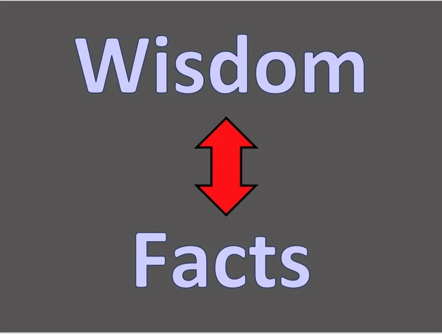
But how to do that? Here’s the slide I show:

When you’re preparing a PowerPoint, think what the issues involved are really about. And what in turn are those issues about?
What basic questions are you seeking to pose, then answer? What’s at stake?
Any issue in business or diplomacy or family life or science or politics turns on such things as Freedom, Responsibility, Uncertainty, Risk, Time, Control, Reputation, Respect, Pride, and Security. Contrast one or two of those with, say, some some Generosity, Denial, Obsessiveness, Courage or Fragility.
Once you have a clear sense of the deep, almost philosophical problems in play, you then (a) structure your basic argument, and (b) structure the supporting vivid examples or metaphors or human stories to bring it all to life. Play with surprise:
Then use large fonts and images that fill the screen without words. You have everything you need for a superb and wise and above all convincing presentation.
In doing all this, remember that it’s far better to use a presentation to say one or two big things rather than lots of smaller things.
You typically add value to an audience not by adding ‘facts’ but by sharing wisdom. Why do the facts matter? What happens if you get them right – or get them wrong?

Your presentation must help you start strongly. Don’t make the smallest thing on the title slide your own name. The first thing the audience hears is weak.
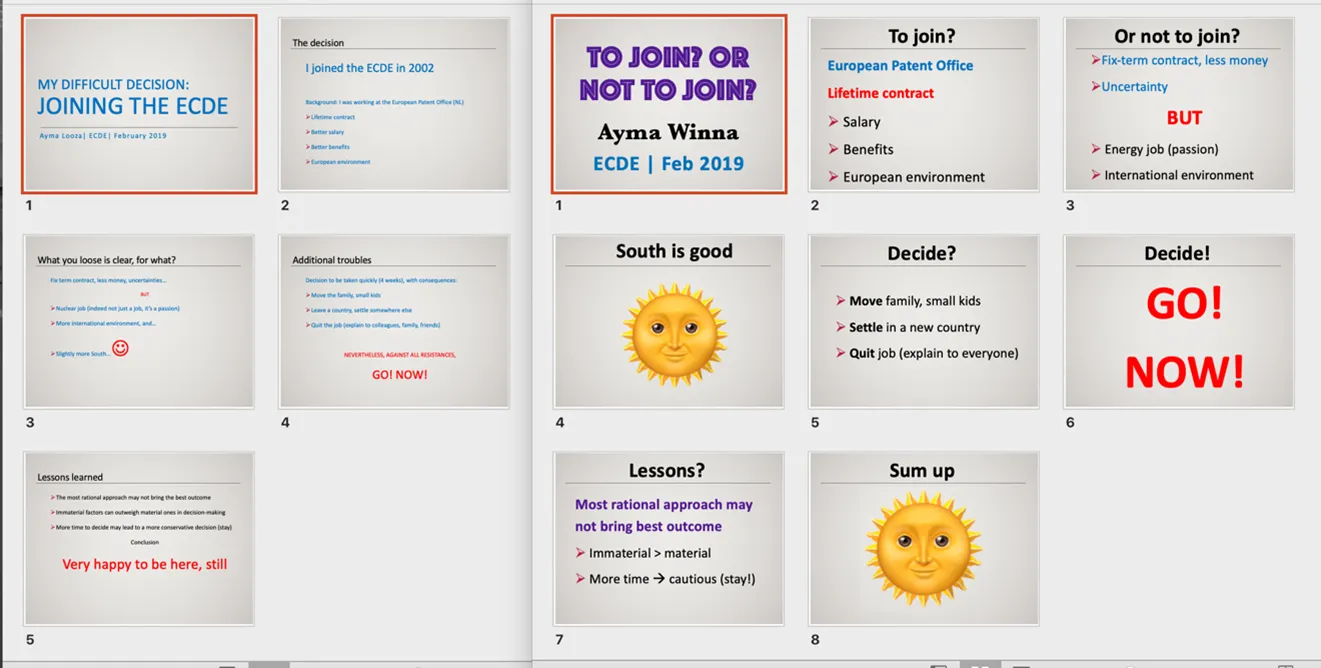
Look at this Before and After example. The smallest font on the Before title slide is the speaker’s name.

By making everything about the presentation including the speaker’s own name bigger and bolder with added light-touch design energy, the speaker projects confidence and thereby gives a clear message. Here I am! Listen to THIS!
“But wait!” they wail. “We have to use our organisation’s PowerPoint template!”
To which one replies: “Tosh!”
Yes, there are house-style issues in play. But within these dreary corporate templates there are all sorts of options for fonts and sizes. Use them to support a simple strong argument.
Look at it another way. To whom do you owe your loyalty?
To the long-lost anonymous PowerPoint template design guy who knew nothing about presenting? Or to the audience sitting in front of you on the day, waiting to see if they listen to you or play CandyCrush?
Sum up? Make it BIG.
Your presentation is your chance to sparkle. Your PowerPoint slides need to reflect and enhance your energy and command. You undermine your own credibility when you’re presenting slides on serious challenginrg issues, but the tone / design of your slides are weak and boring.
Or, putting it another way.
What will everyone else do? DON’T DO THAT.